Variable Width Bar Chart
bar charts
I downloaded this chart on 2023-12-01 from https://www.economist.com/special-report/2023/11/20/trees-alone-will-not-save-the-world. As applicable to all original plots on this site, they might no longer be present at the links where I found them by the time you read this: the Internet is always changing. Of all the charts that I read in the last several months, this is by far my favorite: because even after making an effort, I could not understand what it was about. For sure, I could guess what it wanted to say. But know for a fact? No.
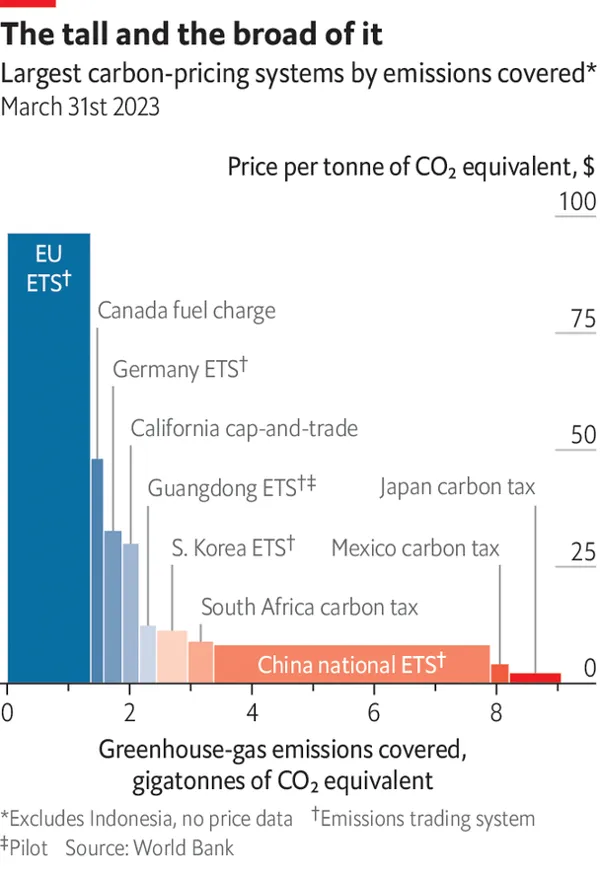
The X axis
The one thing that I simply could not understand, no matter how hard I tried, is the X axis. It appears that the width of the bars varies depending on the quantity of Giga Tonnes (GT) of CO2. But what are those GT figures?
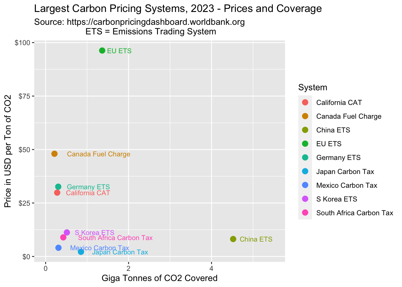
- The reader could expect that the quantity plotted is located in the middle of each bar, consistent with the basic rules for bar charts. Under this interpretation, the EU system covers the least amount of CO2 (say around 0.7 GT), and the Japanese system covers the most (say around 8.3 GT). However, this variant seems questionable. How could Japan cover 12X more CO2 than EU, and how could both Japan and Mexico cover more CO2 each than China?
- Next, we might guess that the GT amount should be obtained by subtracting the left border of each bar from the right border (B minus A). Under this interpretation, EU covers about 1.3 GT of CO2, and China about 4.5 GT. If this is true, then the position of the bars on the chart has literally nothing to do whatsoever with the actual figures - which, in the absence of a note (such as “the bar order is driven by CO2 prices”), I find very, very odd indeed.
- As a bonus, note how difficult it would be to retrieve the actual figures: one is stuck trying to estimate 2 numbers on a scale, and take their difference.
With interpretation #2 above being my favorite, the only way that I could convince myself that it was true was by locating the actual data on the Carbon Pricing Dashboard from the World Bank. [By the way, that is another great example for how to confuse and mislead readers. You may want to check it yourself and see how “easy” it is to arrive at this simple set of numbers: Giga Tonnes of CO2 and Price by country. If you think that charts can be confusing, then just wait until you see some of the dashboards out there.]
And indeed, the actual data confirmed my guess that the second interpretation is the right one. Here is the same data, plotted in a reasonable and user-friendly way:
Market Sizes
With the first impassable obstacle out of the way, we can examine the other major design choice behind the original chart: bars of various widths and heights. That feature suggests that we should pay attention to the areas of those rectangles - but how? If we multiply the price in $ per Ton of CO2 with the number of Giga Tonnes, then we arrive at the total Market Size expressed in $. That’s clearly no rocket science, but nor is it mentioned anywhere.
Now, if have the total market size in $ and want to compare different countries, how are we supposed to do it? We are faced with the dilemma of comparing tall & narrow bars with wide & short ones. Given any two such bars, which one is larger, and by how much? It only takes a small glance at the original chart to realize that comparisons are very difficult and in some cases nearly impossible to make. For example, I can tell that the Chinese carbon market in $ is smaller than the EU one - but how many times smaller? Maybe ~4 times, or is that somewhere around 5-7X? There is simply no way to tell for sure, short of using a ruler.
The best way out is a chart that shows those figures explicitly, instead of leaving it to the readers to do some visual math in their heads:
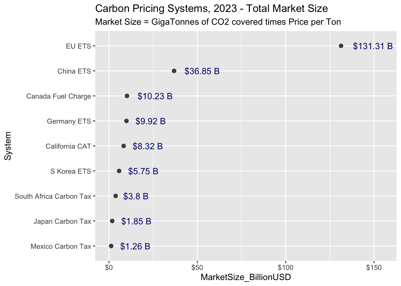
So, the EU CO2 market in USD $ is currently about 3.5 bigger than the Chinese one, and ~13 times bigger than the Canadian one. Just for the fun of it, scroll up and see if you could have determined this based on the original chart.
All In One
Finally, I wanted to point out that there are ways to put all this info onto a single chart, for example by making the point sizes (and/or colors) proportional to the size of the market:
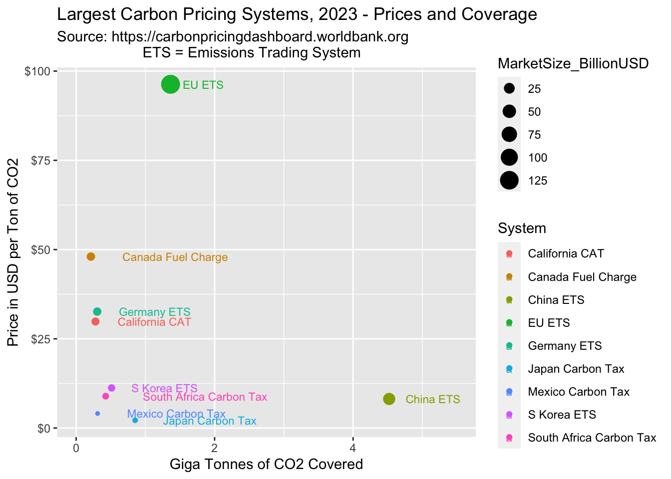
Usually this does not work as well as printing or labeling the market size explicitly (on a separate chart) - but as a first pass, this kind of plot is perfectly adequate. When more details are needed, it is best to produce a dedicated chart.
Summary
1. Before
2. After
