Truncated Bar Charts
bar charts
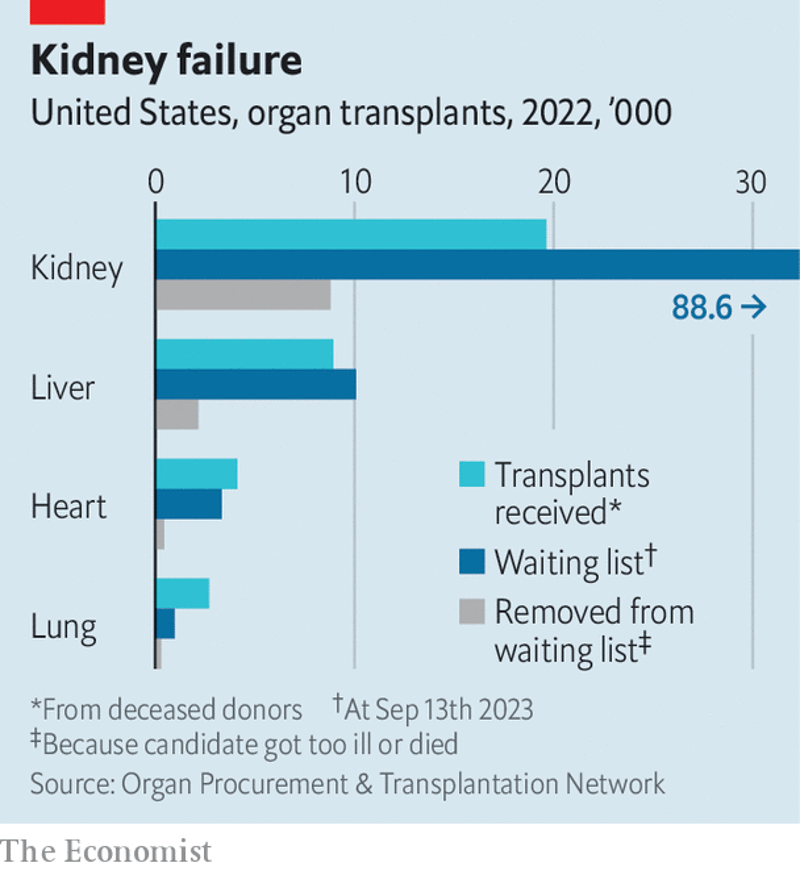
I downloaded this chart on 2023-09-28 from https://www.economist.com/united-states/2023/09/16/in-america-lots-of-usable-organs-go-unrecovered-or-get-binned. As applicable to all original plots on this site, they might no longer be present at the links where I found them by the time you read this: the Internet is always changing. The one thing that initially drew my attention to this plot was the truncated X axis. I can guess the intention behind that decision: to make the other figures easier to read, by not letting one large value “squeeze” them against the Y axis. However, is that a good idea? Maybe yes, but more likely, maybe not.
What comes first
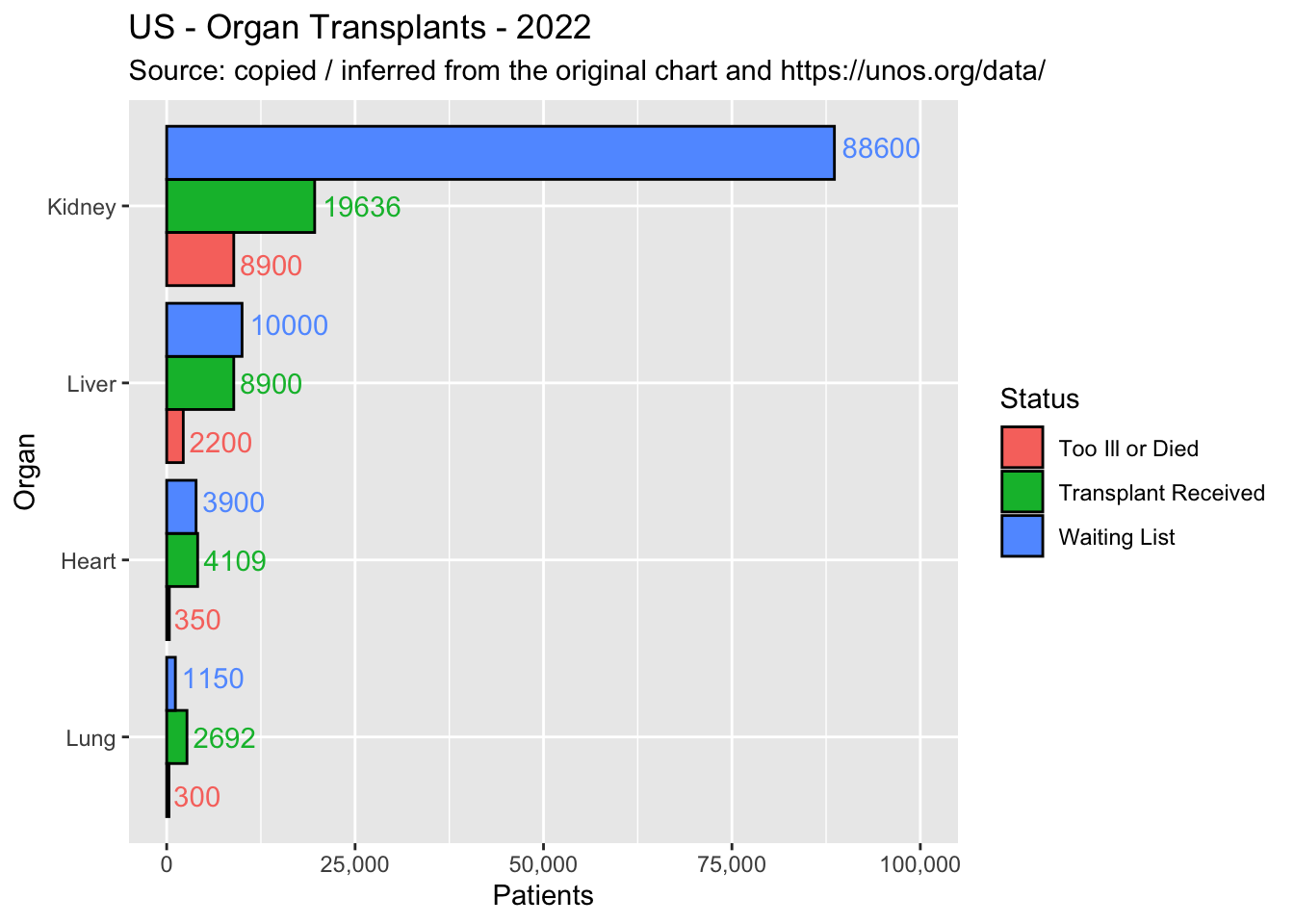
One key question to ask ourselves in this kind of scenario - one large value that “compresses” the other ones - is what is more important, in general. If you only had a couple of seconds to spare, what would you want to learn most? (A) That one category (e.g. Kidney) is much larger than the others, or (B) that some subcategories are somewhat larger or smaller than others (e.g. transplant received vs. waiting list for Heart)? Personally I vote for (A), no doubt about that. What comes first should be shown first, so my initial revision is to show the full data exactly as it is, with no omissions:
Doesn’t the original version show the same thing? Well yes it does, but only sort of: because the reader must pay attention to the “88.6 ->” label, which is not the same thing if you ask me. The other significant improvement, that I wrote about on this blog before, is to label the data points. That helps to speed up our understanding and eliminates the need to consult a separate table.
Similar or Different
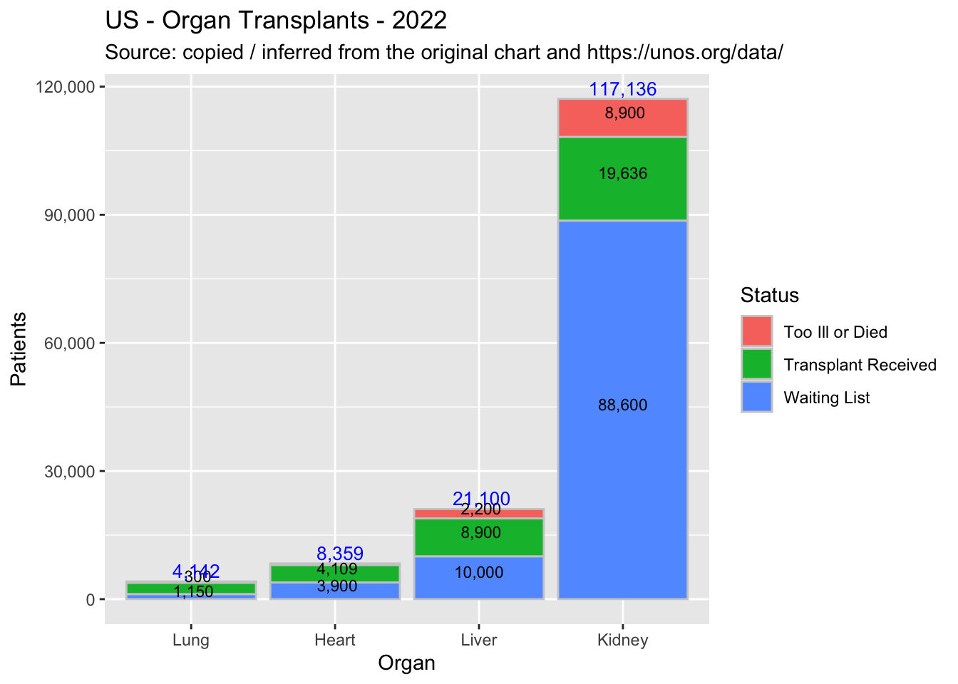
The other big issue with the original chart is far more subtle - but to compensate, also more important (haha). I bet that if you stopped reading here for a few minutes and thought about it, without peeking at the paragraph below, you would not guess what it is.
What can help us to identify the other issue is thinking about the degree of similarity between the Status categories:
- Are they different - in which case they should be plotted side by side, as the original chart does?
- Or are they similar, in which case they should be combined in the form of a stacked bar chart?
In my opinion, they are clearly similar: they are all transplant cases, just in different stages. Crucially, the similarity means that all those transplant cases can - and should - be summed up so the reader can understand at a glance the magnitude (and rank) of the problem for each organ. This is something that the plots thus far fail to accomplish, but my second version shows at a glance:
Proportions and Trending
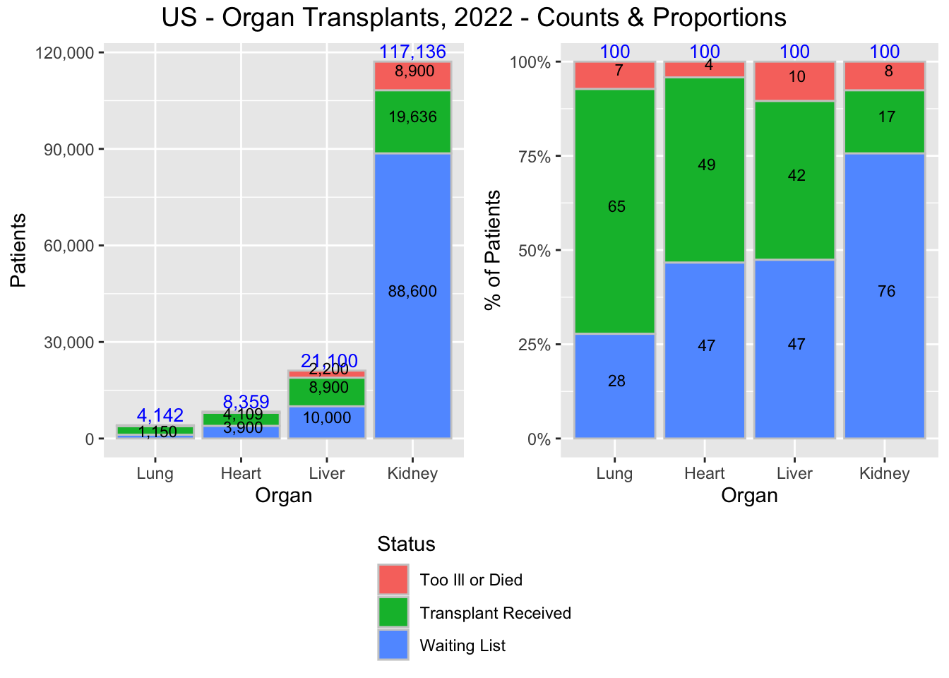
Another thing that this new format makes clear is that we can - and should - look at the percent distributions as well. That provides a cleaner and better solution to the dilemma that apparently motivated the original plot. As it turns out, we do not have to choose one or the other, we can do both: plot all numbers (including the big ones) and also have available the small details. Maybe not exactly on the same chart, but close:
There is yet another large advantage that is built into the new format: trending. We only have the data for a single year, and I did not try to get more, however the fact is that our new format - with the Statuses combined and shown in stacked format - makes it possible to display several years of data, if need be. The same thing is essentially not possible under the original format.
Summary
My last chart above makes clear the following:
- Kidney transplants are a much bigger problem than Liver transplants (about 6X bigger), and also are about 3.5X bigger than all other transplants combined.
- Heart transplants are more than 2X smaller than Liver transplants.
- Organ transplants with higher patient counts also have higher proportions of patients on waiting lists. The higher the demand, the worse it is met.
Does the original chart allow us to draw the same conclusions quickly? Well; No.