Area Charts
area charts
bar charts
stacked bar charts
line charts
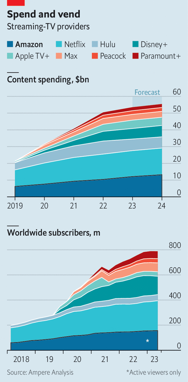
I downloaded this chart on 2023-09-09 from https://www.economist.com/business/2023/08/27/amazon-has-hollywoods-worst-shows-but-its-best-business-model. As applicable to all original plots on this site, they might no longer be present at the links where I found them by the time you read this: the Internet is always changing. My first impression was good. We have some pretty interesting information about streaming TV providers, in an attractive format. Both the content spending and the number of subscribers have been increasing significantly over the last few years. However, the closer you look, the more issues you’ll find. In fact there are so many holes behind these charts that I will have to describe them paragraph by paragraph.
Area Charts and Frequency
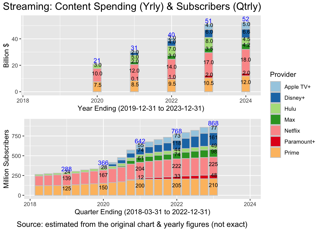
Area charts are meant for series with relatively high frequency. In those cases, instead of having a chart with a lot of stacked bars that are close to each other, you might as well fuse them and produce an area chart. So when I saw these area charts, I thought that the underlying data series had a pretty high frequency. But if you look closely at these plots, the first data series is yearly (! - the lines are pretty straight, just a few segments), and the second series appears to be quarterly (presumably taken from 10-Q and 10-K reports). Producing an area chart for a yearly series having 6 data points? That looks quite questionable - and misleading - to me.
Misaligned Time Scales
The second big issue is the misaligned time scales. This is something that I only noticed after a delay. When I first read the charts, I directly compared them side by side - increase in spending vs. increase in subscribers. Turns out you cannot do that! The first plot starts with 2019, whereas the second starts with 2018. So for the comparison to work, you would have to either shift the 1st chart to the right by 1 year, or shift the 2nd chart to the left – or better yet, have your R or Python script align the X axes automatically for you. This misalignment explains the mystery of Disney+, Apple TV+ and Max apparently spending large sums on content before they had any subscribers.
Missing data & X-axis labels
As I mentioned in prior posts, these do help with readability and it is good practice to (almost) always use them.
Taking all of the above into consideration, we arrive at this updated version:
Note that, unlike the original version, the update:
- makes it very clear that the data is yearly for Spending, and quarterly for Subscribers
- shows that the time periods are different (2019 to 2023, respectively 2018 to 2022)
- prevents the reader from inadvertently comparing different time periods
- avoids the Area Chart format, which is mostly a gimmick in this context (5 bars do not an area make… not even close)
- clarifies the X axis and adds data labels for selected periods.
Is the updated version ideal? Maybe not, however it is a very good starting point and it does make it much harder for someone to jump to incorrect conclusions.
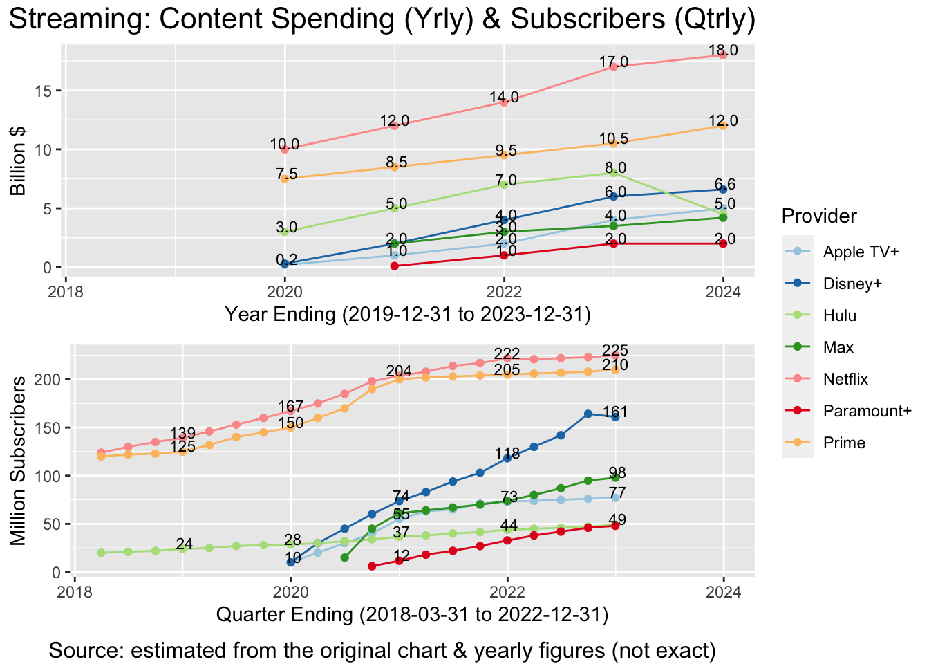
Difficult comparisons between providers
Area charts, similar to stacked bar charts, can make it quite difficult to compare and understand the individual series. Taking an area or bar sequence from somewhere in the middle of the stack, and converting it in one’s mind to normal XY coordinates, is hard and likely to lead to incorrect conclusions. That is where converting the charts from area or stacked bars to lines can help quite a bit. We lose the totals, but can understand the components far better and far more easily:
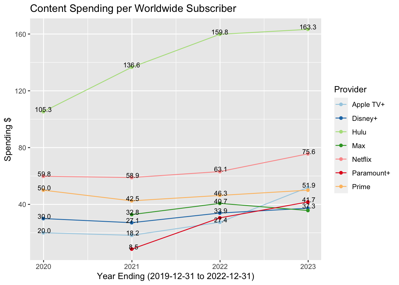
Content Spending per Subscriber
With the series cleaned up, we can now consider a brand new metric: the content spending per subscriber for each streaming-TV provider. This is something meaningful that comes pretty naturally at this point - but we may have ignored it if only looking at area charts. Note that I only kept the year-end data points. With the number of subscribers being quarterly, one might want to calculate an average number of subscribers per year. But for simplicity, I just kept the Q4 values.
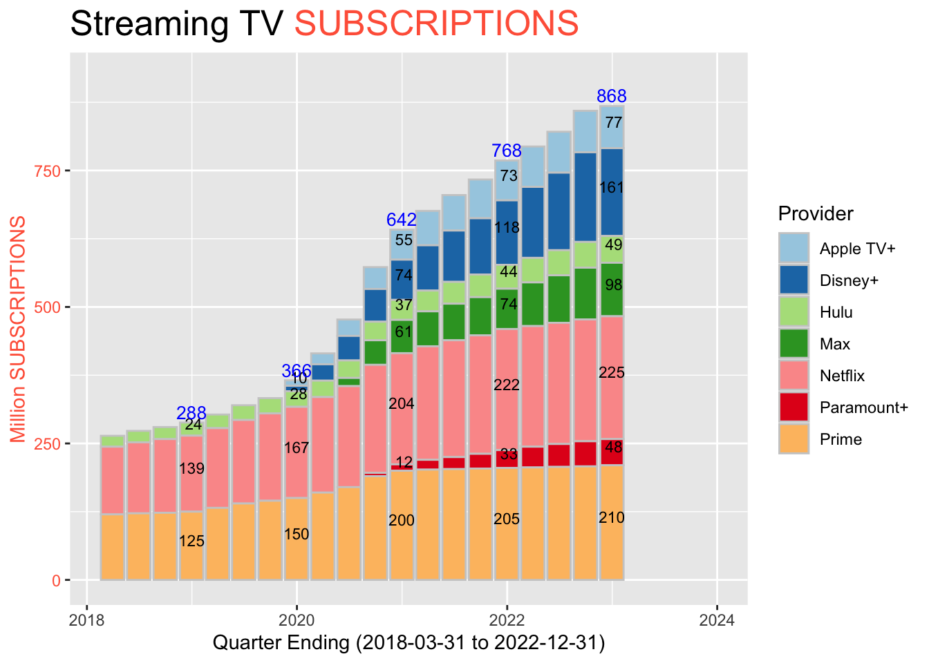
Worldwide Subscribers?
I left for last what is perhaps the most treacherous thing behind the original charts. Chances are that you haven’t noticed it yet - and you might never will, without reading about it here. It goes as follows. The money spent by different providers is separate and can be added up without worry. Want to see the total spending? No problem, just add up the parts. The number of subscribers cannot however be simply added up… because some folks subscribe to multiple providers!
That is how the area and stacked bar charts on this page are guaranteed to be anywhere from moderately to very misleading, depending exactly on how many folks subscribe to 2, 3, 4, … providers. Moreover, our data does not allow us to solve this issue here. If we had an internal database with the customer ID and a flag with all the providers that they subscribe to, then we could make adjustments for this situation, one way or another. But since we don’t, we won’t. At a minimum however, the original chart should have included a prominent disclaimer to that effect, to avoid misleading the readers.
However, there is a simple way out of this situation, after all: replace “subscribers” with “subscriptions”! The edit might seem a bit frivolous - but the change in meaning is profound. This time, since all subscriptions are unique and separate, they can be added up without worry:
I’m not revising the other chart - Content Spending per Subscription - since that’s also clear now. Note however that thinking about Subscriptions rather than just about Subscribers naturally opens up the other possibilities out there: how many people are watching in each household, how many customers have multiple subscriptions, how many might be watching with their friend’s subscription, and so on.