Stacked Bars and Proportions
bar charts
stacked bar charts
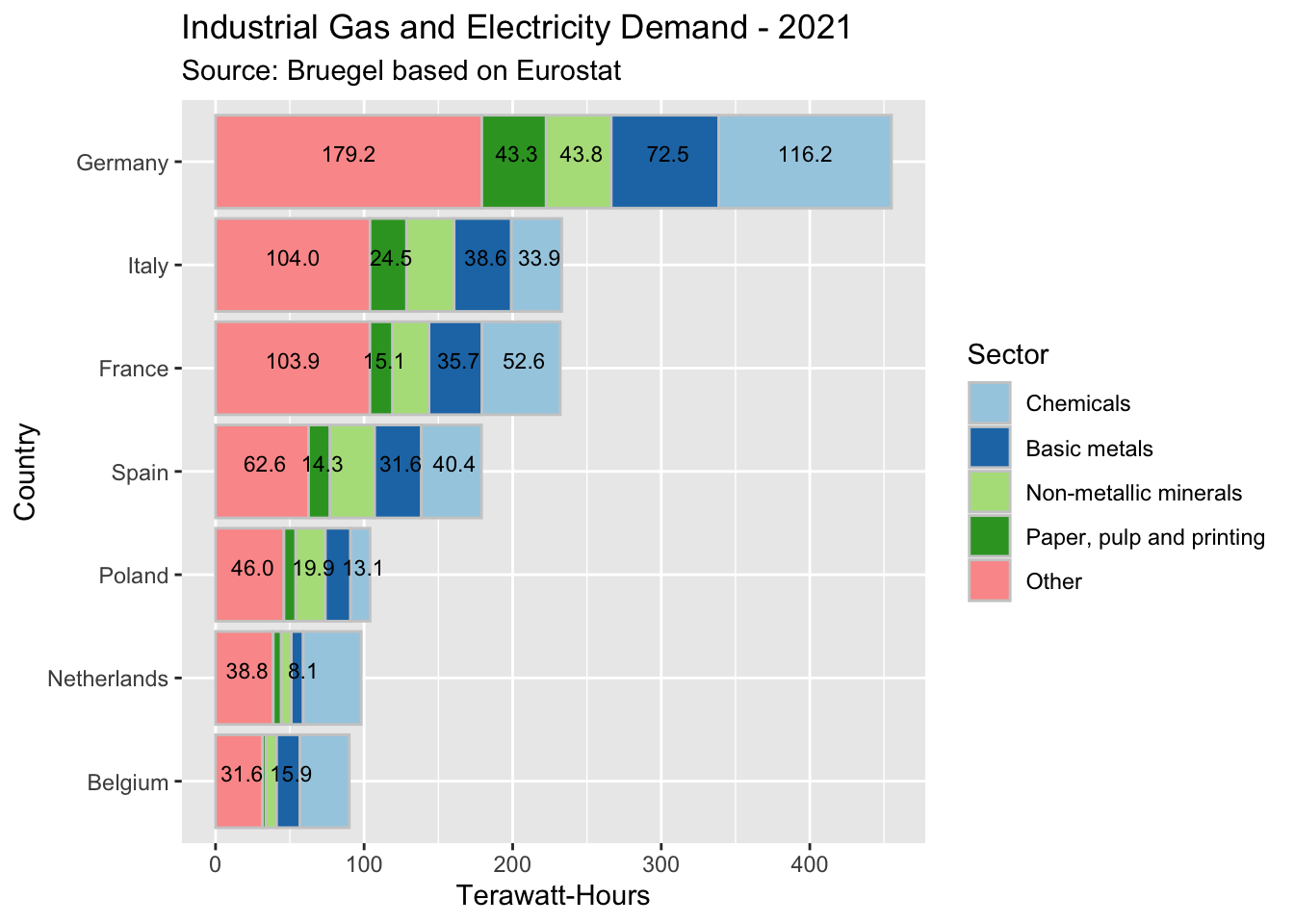
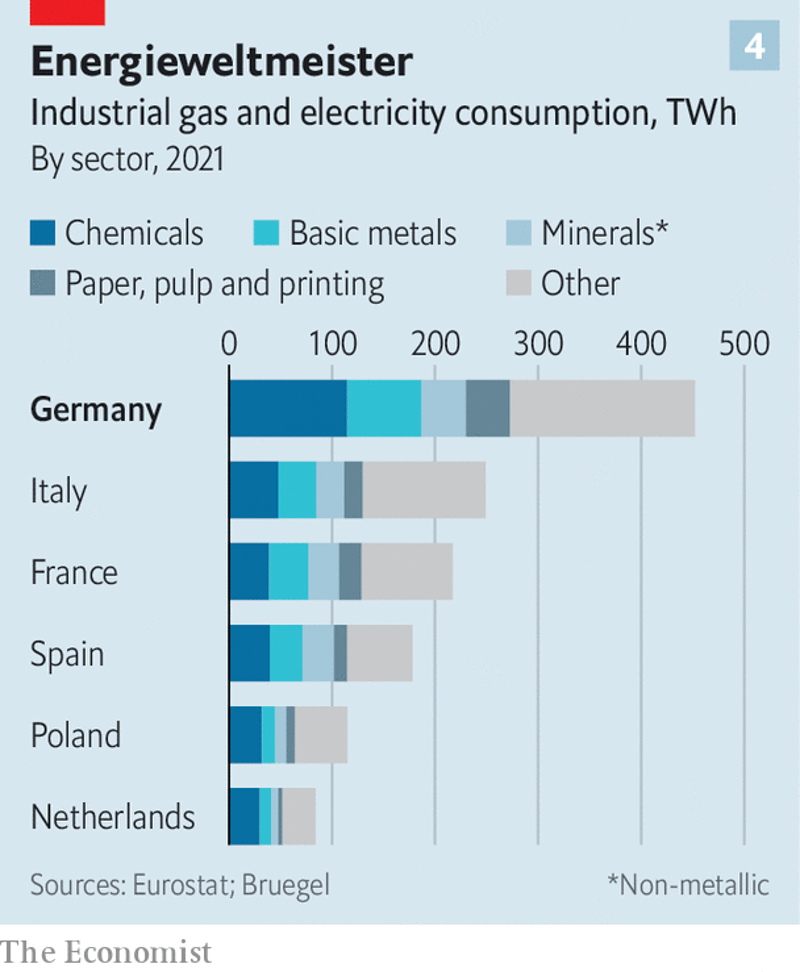
I downloaded this chart on 2023-08-30 from https://www.economist.com/finance-and-economics/2023/08/17/the-german-economy-from-european-leader-to-laggard. As applicable to all original plots on this site, they might no longer be present at the links where I found them by the time you read this: the Internet is always changing. At first sight, everything is fine. One thing however which looks rather obviously missing to me is the data labels. Those can make most if not all charts easier to read and understand, so why skip them?
And indeed - note how many more details we now have available on the chart (for those who may need them) - while also preserving the user-friendliness and brevity of the initial version.
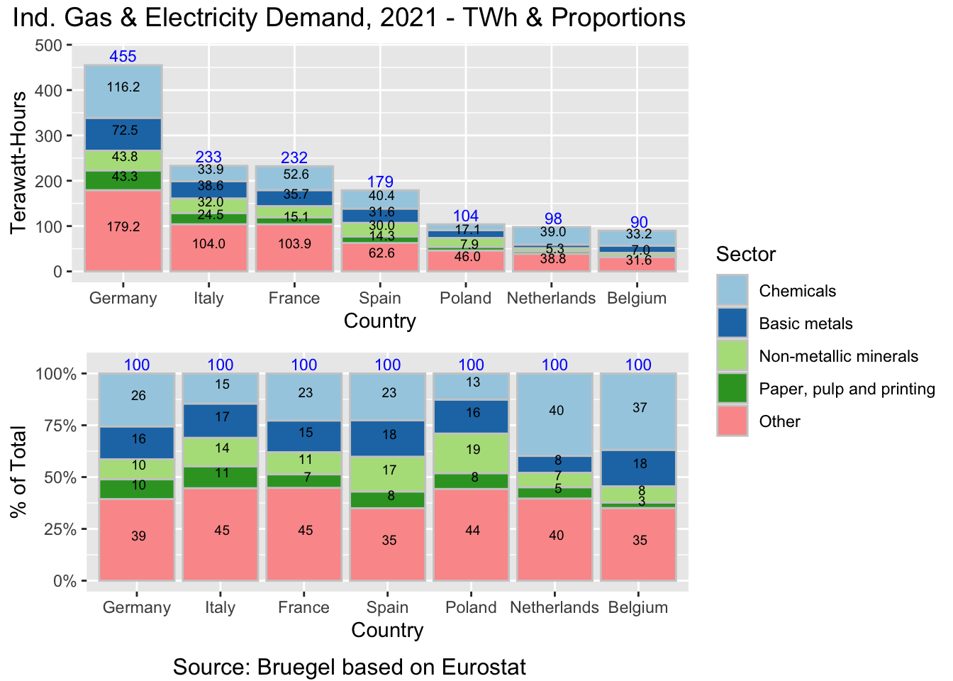
- For example, did you know that the combined Industrial Gas & Electricity demand from the Basic Metals sector in Germany in 2021 was 72.5 Terrawatt-Hours? I bet you didn’t - the best you could have done is approximating that number from the chart. But why ask the readers to approximate the figures, should they need to - when you can just show them?
- Note that the 72.5 TWh is merely one example. The universe of [charts + figures] where this guideline - “just show [some of] the data” - may come in handy is very large indeed.
At this point, you may have noticed a new issue: due to overlaps between the data labels, some of them are not plotted. And we don’t even have large numbers here. You may have charts out there where the figures are in the thousands or millions, or have several decimals that should all be printed. In a case like that, this design becomes problematic because there is simply not enough space to print the data labels.
That is how we are better off flipping the coordinates - note how the number of printed data labels has increased significantly. While we’re at it, let’s fix another significant omission and add the data labels for the totals. This is actually a significant strength of the Stacked Bar chart design - showing the totals at a glance - which I like to enhance further by labeling those data values as well:
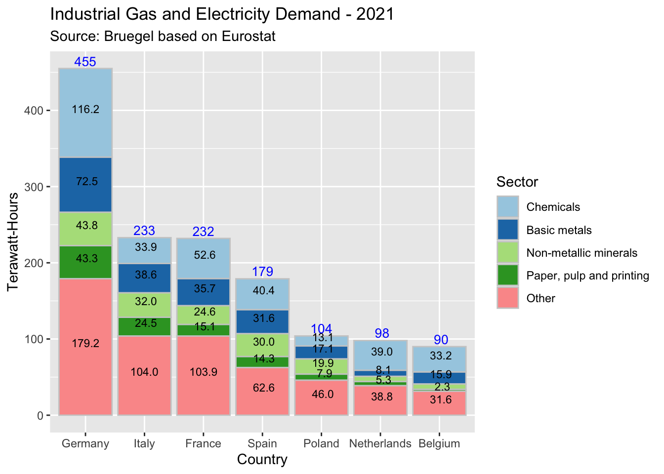
Flipping the coordinates is not a universal solution, though. In some cases it may not work because there are too many bars relative to their labels (in this case, country names), for which we would then not have enough space. But in this case, we are better off with vertical bars.
That brings us to the next significant omission from the original chart. It is an implicit rather than an explicit one, but important: the proportions are absent. Perhaps [someone thought] there is not enough space available for another chart on a page somewhere - but for your real projects where it is important to understand the data to the extent that you can, you really don’t want to skip this:
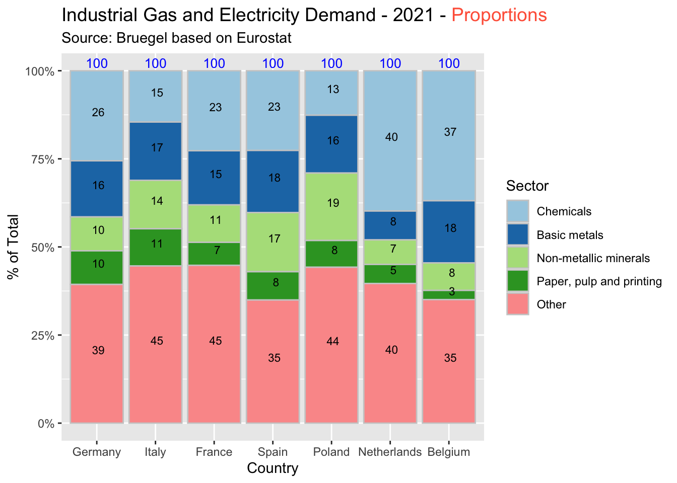
As a side note, the “%” is very easy to add but I omitted it from the labels above - to obtain a cleaner look. So 35 stands for 35%, and so on.
Would you be able to calculate the % distributions in your head, on the fly? To some extent, sure, maybe. But to the degree that you can just read on this upgraded version, most likely not. Numbers are already hard to read and understand. There is no need to make that task even harder by not calculating and showing the percentage distributions.
Summary
1. Before
2. After
By now, we have significantly upgraded the utility (if perhaps not the design) of the initial chart.
As a reminder, this blog is primarily focused on the utility - rather than the “graphical design” - of charts. Typically, I don’t try to make my charts look “the best”. Sure that extra effort is expected for a presentation or memo or article; but for analysts whose priority is understanding the data, utility comes first.
However, the same question rears up its head: should we use a bar or a line chart? Let’s leave that for the next post.