Bar Chart or Line Chart?
bar charts
line charts
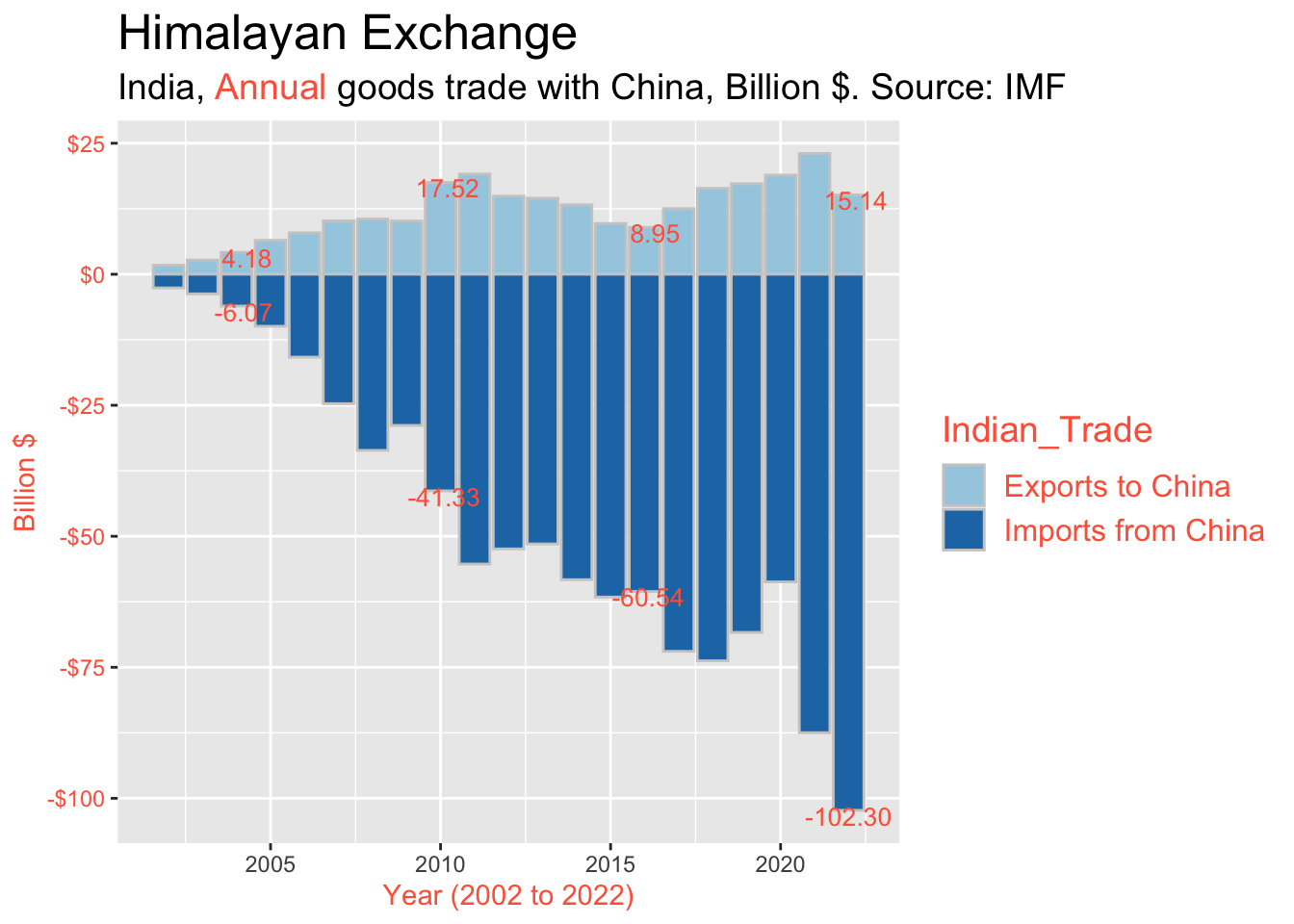
At this point, we have the modified bar chart from my prior post. One key question that we have to keep asking ourselves is: are we better off with a bar chart, or with a line chart?
As you would expect, there are pros and cons attached to each option. Some times a bar chart works best; other times a line chart works best. And it goes without saying, there are a lot of cases out there where two versions - bar chart and line chart - work best, side by side. Unless your space is very limited, why not do both and let the reader choose which one to focus on? Personally I would read both (but likely focus on the line chart).
Line charts have a key advantage compared to bar charts: they can present a lot of information using very little ink. This is the data to ink ratio popularized by Edward Tufte. As a consequence, it is often very easy to add an additional series to a line chart – whereas attempting the same thing with a bar chart can easily lead to a jumbled, unreadable mess.
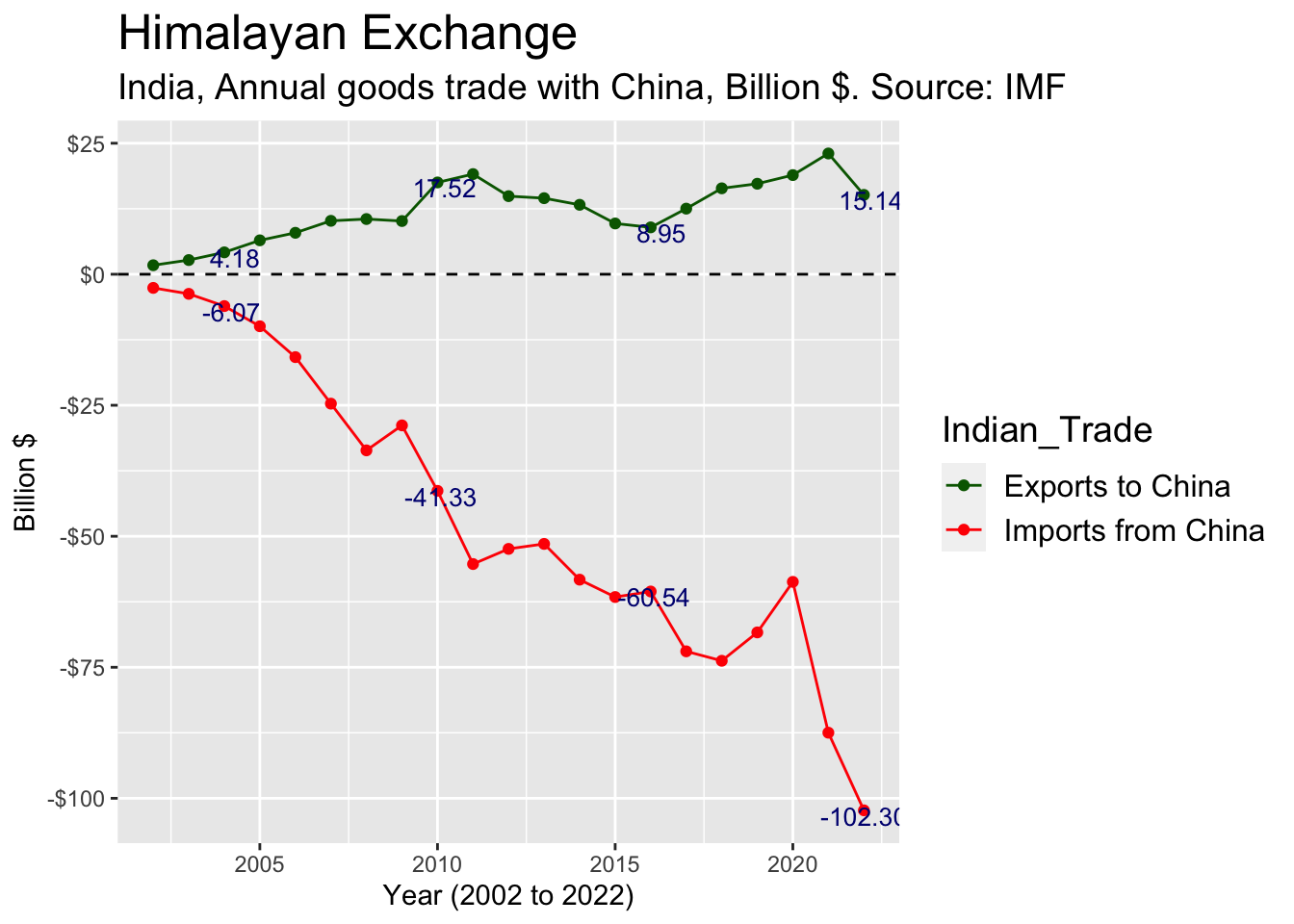
Much cleaner, don’t you think? [ Not coincidentally, line charts are also very friendly on your printing budget: your ink or toner will last much longer. ] But this simpler and more elegant look is just a start: it can not only facilitate understanding, but also enables the addition of more useful information.
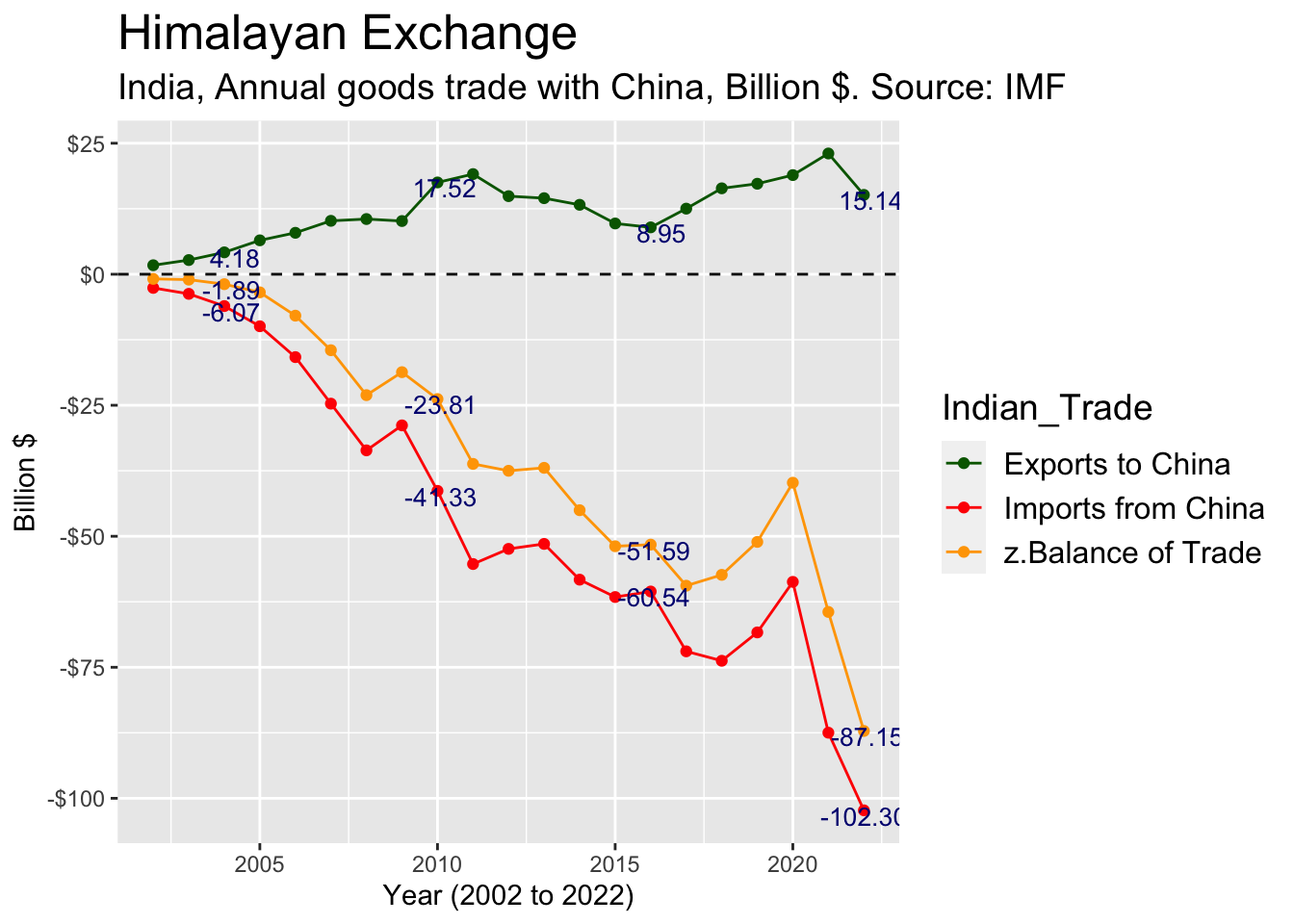
Given our example, one relevant metric that we may want to display is the balance of trade: Exports minus Imports. Note that this is very difficult to accomplish with our original bar chart design. (Sure, you could dump another series on top of those two, but then your masterpiece would likely become hardly readable, and ready for filing in your trash folder.) However with a line chart, this enhancement is very straightforward:

Is this line chart stuff really worth the hassle? Certainly so, I believe. Keep in mind that this data set is only one example. (Besides, does it even matter what the two tiniest countries in the world have been doing with each other over the last 20+ years? It seems doubtful… I cannot be bothered myself.)
You might perhaps want to argue that it was already apparent from the bar chart that the Balance of Trade was negative, and getting smaller (or larger in absolute terms). Sure, that was pretty easy to see from this data. However: not all series are as easy to read, and in many cases it can be genuinely difficult to subtract or add two series in your head - and determine resulting pattern (increasing, decreasing, roughly the same, cyclical, etc.) without fail. Whereas when we calculate the difference and plot it on our screen or a piece of paper, that cannot go wrong.
Summary
1. Before
2. After