Double Bar Chart
bar charts
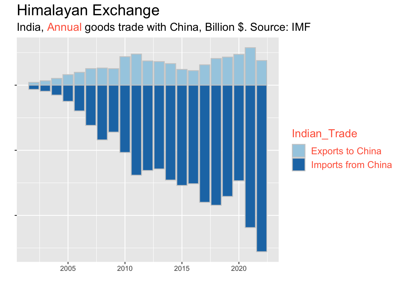
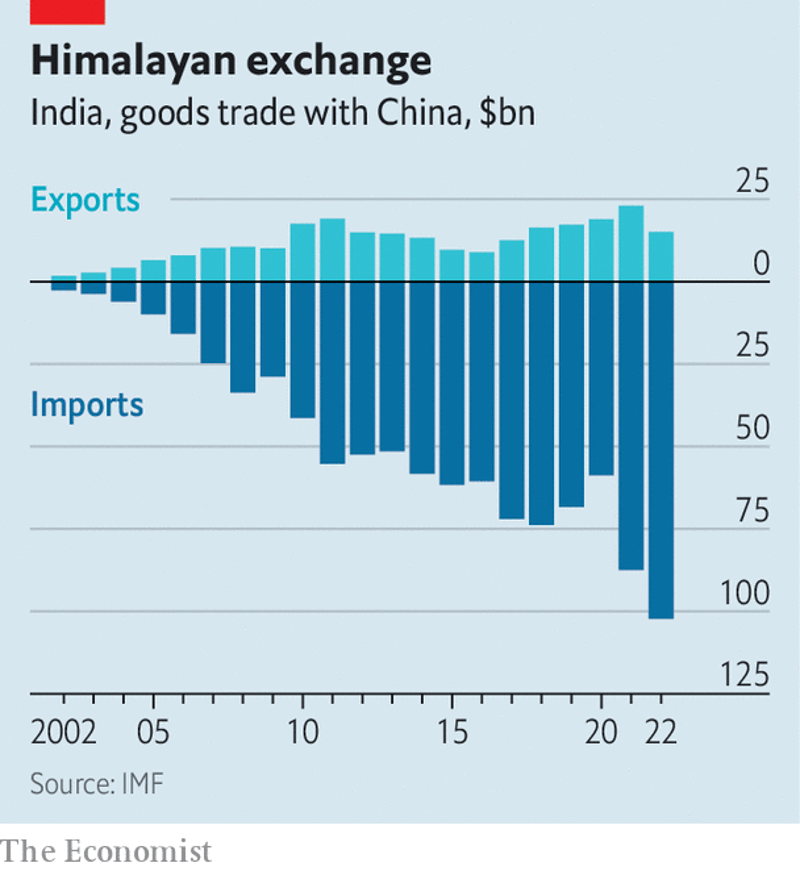
I downloaded this chart on 2023-08-29 from https://www.economist.com/business/2023/08/14/can-india-inc-extricate-itself-from-china. As applicable to all original plots on this site, they might no longer be present at the links where I found them by the time you read this: the Internet is always changing. At first sight, everything looks fine: India exports less to China than it imports. However, as we will see below step by step, this chart suffers from a number of issues that could have been avoided.
First of all, what we have there are annual figures. It might seem obvious, but it really should be stated - instead of leaving the readers to guess.
Then, what about the legend? It couldn’t get clearer than that, apparently - Exports and Imports. Or could it? For example, are those Exports from India to China, or from China to India? (Try to answer right here, if you can: without glancing above.) The subtitle of the chart, as well as the full article, will allow the reader to infer that those are exports from India to China. But still: why not state that upfront, and thus eliminate the possibility of a misunderstanding?
Next, take a closer look at the original Y axis. The values above $0 are positive, as expected - but they are also positive below $0! How is this possible?
On the Y axis, values below $0 cannot be positive. It appears that the intention there was to remedy one of the issues behind bar charts: multiple series can make the plot look quite crowded if the bars are plotted side by side.
Putting the Imports below the Exports avoids that particular issue - but if so, then their values should have been made negative. As a side note, having negative values for Imports in the context of Export - Import imbalances is OK.
Yet another issue is the lack of a label for the Y axis, as well as the $ symbols to make it clear that the quantity being plotted represents currency amounts (those are Billion $!). Sure, one could argue that this is already quite obvious. But still: why skip it? Communication is hard, and every little bit helps to carry our point across.
Similar considerations apply to the X axis. As noted earlier, these are annual amounts. Specifying a label for the X axis (“Year”) makes our chart even easier to understand.
Additionally, it is always helpful to state the time period behind time series plots: because that is not always obvious. That’s how I prefer to customize the X axis further (“2002 to 2022”), with the objective being a maximum of clarity for a minimum of reading effort.
Putting all of these things together, we arrive at this updated version:
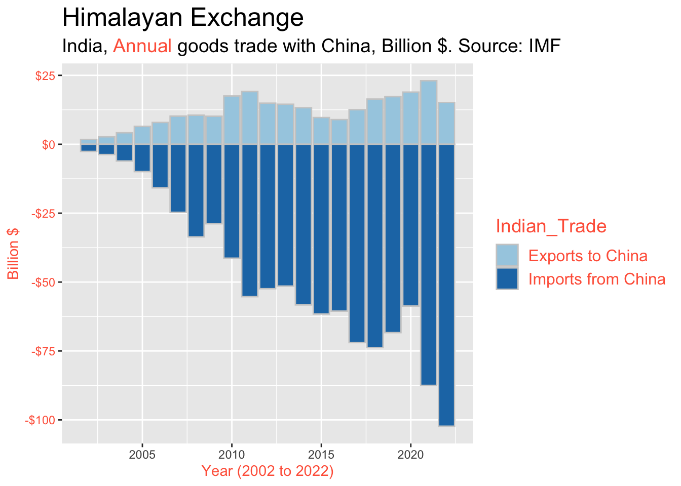
Are we done? Not yet. A significant missed opportunity is the lack of data labels. In general, data labels are a great way to highlight certain key values, as well as to make your plots easier to read and understand. Labeling every single point is overkill and will lead to a very crowded chart (unless we have just a handful of records), therefore it is typically better to label just a subset (starting from the latest value backwards).

However… is this the best that we can do? Maybe yes, but… maybe not. One key question is whether we should have used a bar chart in the first place: perhaps we can do better with a line chart? This is something that we will explore in the next post.
Summary
1. Before
2. After
